
Logos
Below is a sample of the logos I have designed for companies and organizations.
Blues
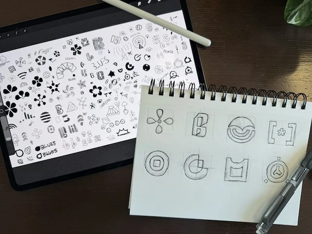
When creating the Blues brand, my goal was to design a mark that was both meaningful and simple in a way that honored the founder’s vision while reflecting the company’s origins. It needed to be easily repeatable on various applications as the Blues products can be as small as postage stamps, and it needed to cut through the dated and tired standards of the IoT industry. Through conversations with Ray Ozzie about his work developing new technology in the aftermath of the Fukushima nuclear incident, and the real-world impact that his new technology had on people in the affected region, I found strong inspiration in Japanese regional art and design. This ranged from city and prefectural iconography to metro and transit systems, where clarity, function, and symbolism coexist.
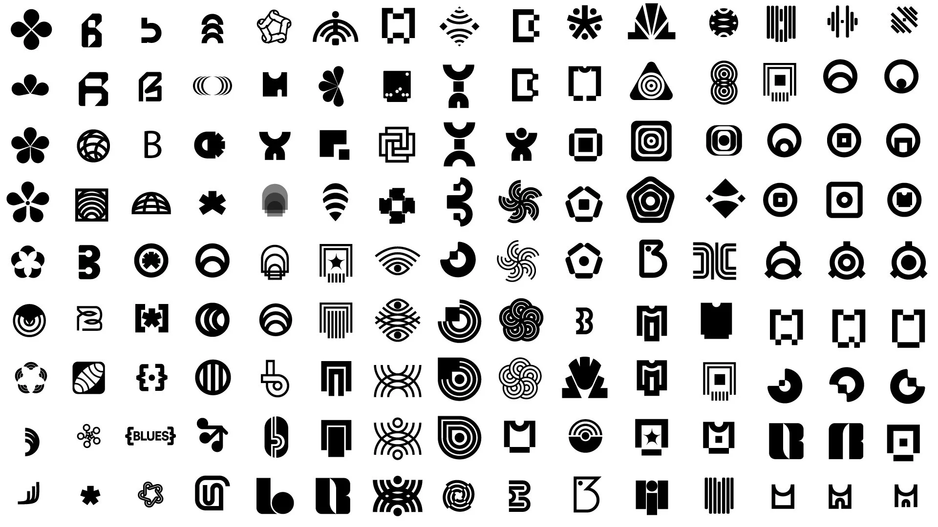
I also wanted the mark to embody the core idea behind Blues’ technology: interconnectedness- not just between devices, but between people and the increasingly advanced world they inhabit. I explored hundreds of iterations, experimenting with form, proportion, and symbolism to distill these ideas into something clear and enduring.
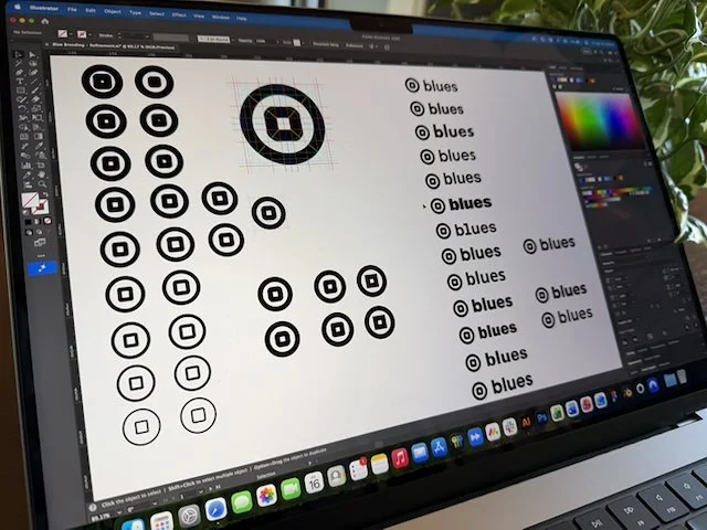
The final result is a simple, powerful symbol designed to scale seamlessly across a wide range of applications. The mark-often referred internally to as the “squircle”-draws direct inspiration from the Fukushima Prefecture flag, as well as the idea that the Notecard can fit into virtually any device. Using Euclidean geometry, I defined the relationships and proportions within the symbol itself and its connection to the wordmark, and also expending to the broader branding system, creating guides that are both intentional and highly flexible.
At the conclusion of the project, leadership remarked that the depth, rigor, and strategic thinking behind the work exceeded branding engagements they had previously commissioned from large agencies costing hundreds of thousands of dollars.


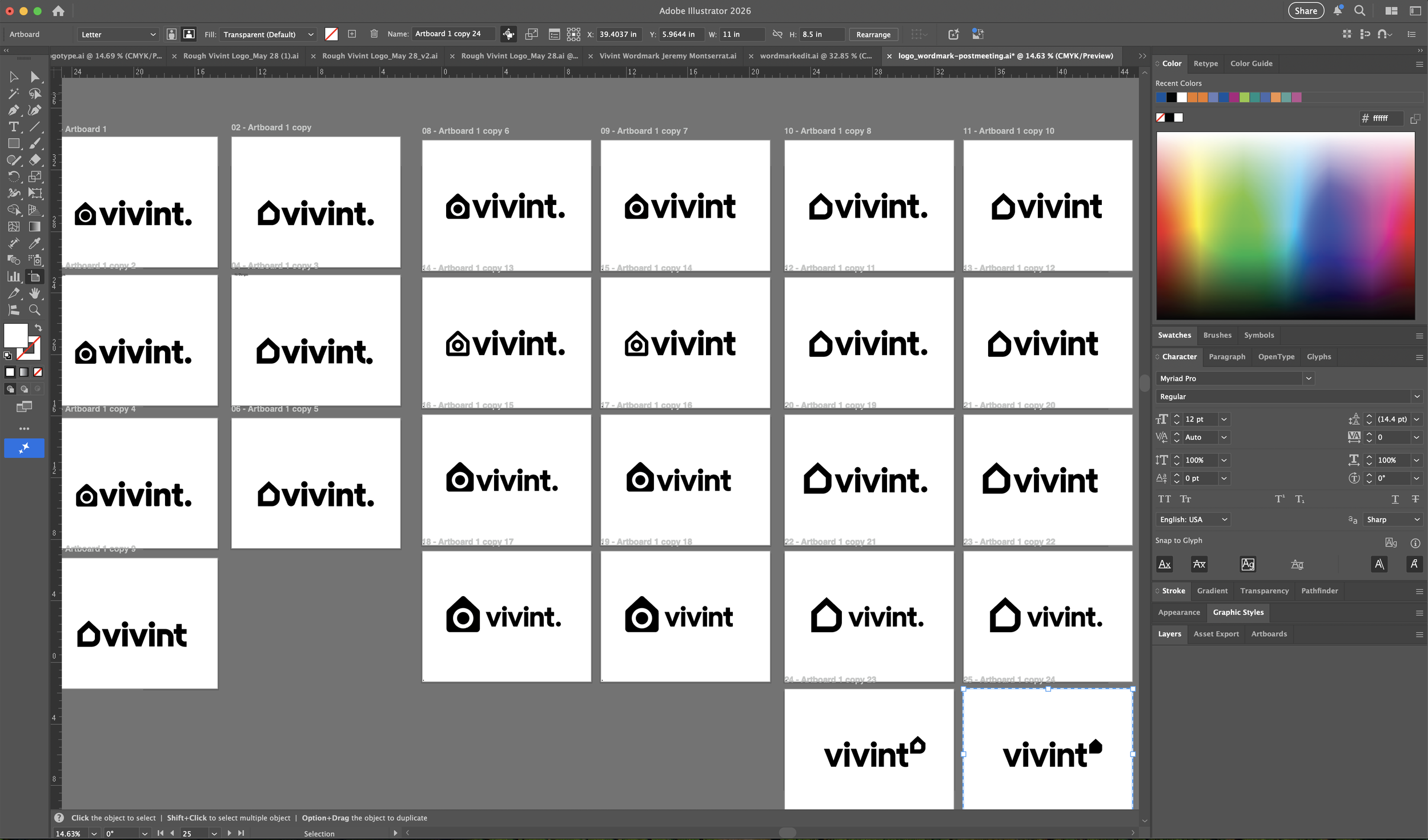
Vivint
In 2020, Vivint’s marketing organization received significant investment and executive approval to support a major phase of company growth. This moment marked a cultural shift toward building a more premium brand- one focused on delivering a high-end experience through thoughtfully designed products and services. To support this new direction, leadership aligned on the need for a comprehensive rebrand that could scale with the company’s ambitions.
The first step was defining a clear marketing North Star. We landed on “Peace of Mind”-a guiding principle that informed every brand decision that followed, from messaging to visual identity. With this foundation in place, we began shaping a brand system that felt confident, modern, and emotionally resonant.
We started by auditing the existing brand and identifying key gaps. As consumer understanding of smart home technology had matured rapidly-accelerated by major players entering the space- it became clear that “Smart Home” no longer needed to live in the name. At the same time, as the product and UX teams ramped up work on a next-generation app, we identified the need for a distinctive and ownable icon system built specifically for digital environments.
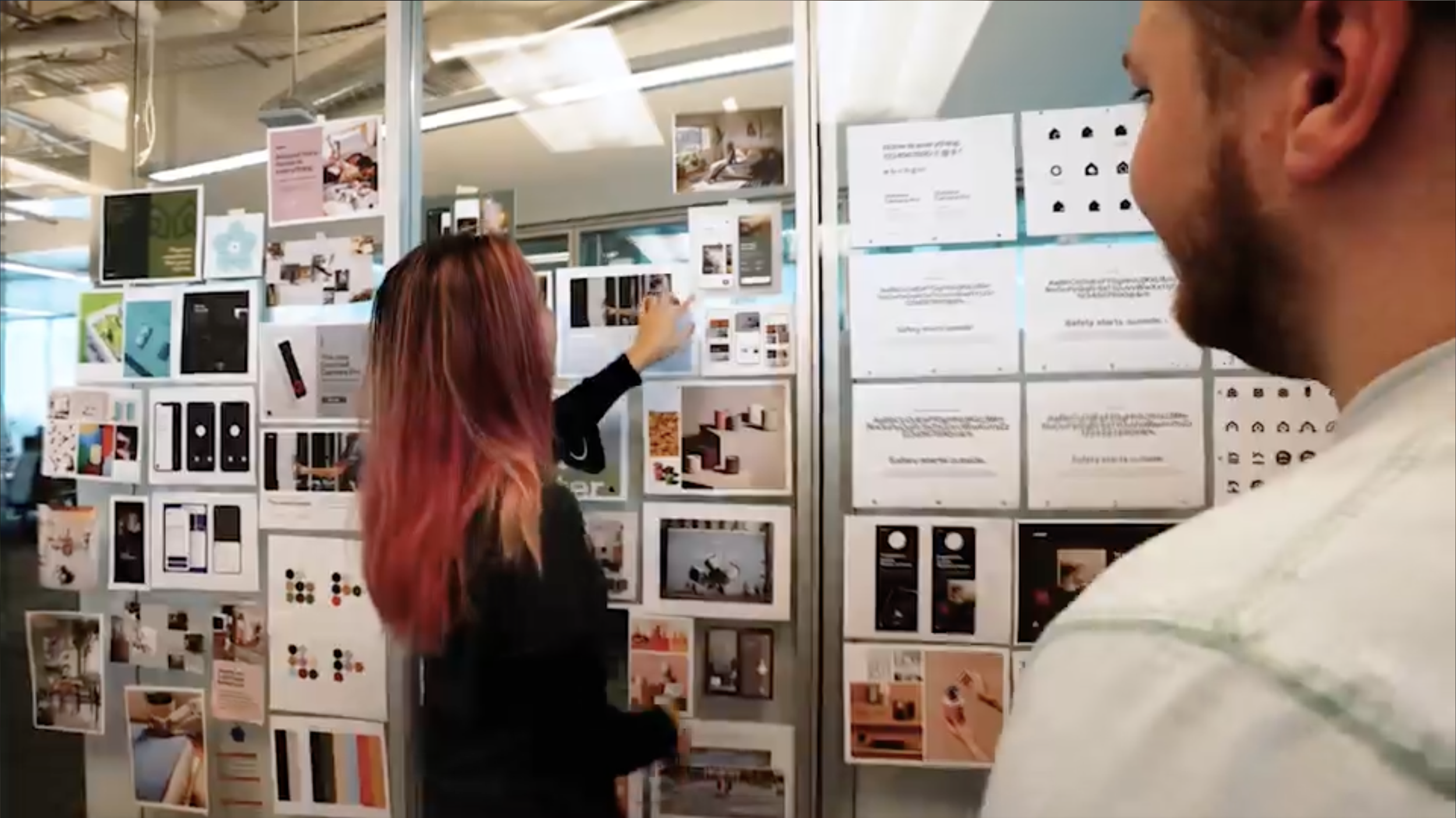
With both immediate and future needs defined, I led the visual exploration phase. This included building extensive mood boards of aspirational brands aligned with our North Star, as well as environmental references- homes, materials, and spaces that reflected how our customers lived and what they valued. These references helped anchor the brand in a lifestyle context, not just a technology category.
I explored hundreds of logo iterations and evaluated an equally large range of typefaces, testing combinations, proportions, and system flexibility. This process ultimately led to a customized variation of Circular, whose geometry and warmth helped shape the final identity, brand mark, and iconography.
Once the core system- logos, iconography, color palette, and typography- was finalized, we applied it across touchpoints including the website, app UI, employee ID cards, apparel, and internal materials. After final refinements, the rebrand was fully rolled out. Post-launch, we tracked performance and saw measurable increases in both brand awareness and sales, validating the strategic and creative direction of the work.


Additional Logos


![Red circle with the text '[SYC]' in black next to it on a white background.](https://images.squarespace-cdn.com/content/v1/61feb70457901a30c6cfb130/c2c9e8b5-778f-4881-976e-068dbee566fc/logos-04.jpg)
![Black background with a large red circle and white text that reads '[SYC]'.](https://images.squarespace-cdn.com/content/v1/61feb70457901a30c6cfb130/1ee0fdef-be6c-4486-94f4-f3442aec64a1/logos-18.png)


